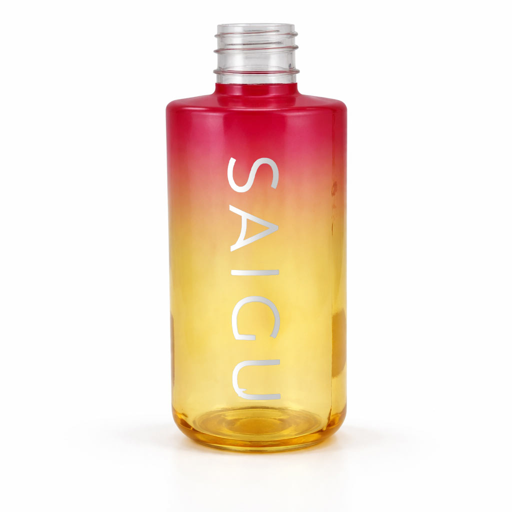

In this project for Saigu, we have transformed a glass container into a visual experience that evokes the sunset and well-being. The challenge was to create a design that reflected the nature of a high-end Body Oil, playing with light and metallic finishes to stand out in the conscious cosmetics sector.
A gradient that plays with light The base of the project is a semi-transparent gradient paint that transitions from intense reddish tones to a warm solar yellow. This technique, carried out in our painting station, offers several advantages:
Selective transparency: It allows the customer to see the texture of the product inside, creating a unique effect of depth and luminosity.
Sustainability: As is our hallmark, we have used water-based inks and paints, ensuring a vibrant finish with minimal environmental impact.
The final touch: Silver stamping To elevate the brand identity, we have applied the silver hot stamping technique for Saigu's vertical logo. Unlike conventional screen printing, stamping provides:
Metallic shine: An elegant contrast that catches the light from any angle.
Relief and texture: A premium tactile sensation that reinforces the perception of product quality.
Superior adhesion: We guarantee that the marking remains flawless despite contact with the oils in the content.
The result is a vibrant, sophisticated packaging that is totally coherent with the brand's values. Yet another proof that at Serigrafía Portal we know how to fuse technology and aesthetics so that each product tells its own story.


